该项目用于材料设计学习,分享
项目地址
主题
兼容
- 兼容低版本继承V7中的Theme.AppCompat
- API 21 以上继承系统自带的android:Theme.Material
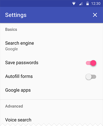
样式配置
- 如图

1 |
|
库介绍
support design (方法数 2126)
位置 : ~/android-sdk-linux/extras/android/support/design
- EditText
- Spinner
- CheckBox
- RadioButton
- Switch(使用supportV7中的SwitchCompat,https://developer.android.com/reference/android/support/v7/widget/SwitchCompat.html)
- CheckedTextView
你不需要做任何特殊的工作,只需像以前一样在你的布局中使用这些控制并且AppCompat会为你做剩下的工作(请看FAQ)。
TabLayout
- 背景色会自动设置成 primary color(主题色)
app:tabMode
- fixed
- scrollable
app:tabGravity
- fill
- center
FloatingActionButton
在材料设计中,引进Z轴概念,Z的高度(elevation+TranslationZ)决定阴影的大小
app:fabSize=”normal”是用来定义 FAB 的大小的(推荐 40dp 的清晰的 png 文件)
- normal的意思是在大多数情况下标准尺寸为 56dp 的按钮
- mini是另一个选择,它的大小将变成 40dp
按钮的颜色,FAB 基本上使用强调色,重写app:backgroundTint属性来修改
- app:elevation 为空闲状态下的阴影深度(6dp 在空闲状态)
- app:pressedTranslationZ为按下状态的(12dp 是按下状态)
- app:backgroundTint - 设置FAB的背景颜色。
- app:rippleColor - 设置FAB点击时的背景颜色。
- app:borderWidth - 该属性尤为重要,如果不设置0dp,那么在4.1的sdk上FAB会显示为正方形,而且在5.0以后的sdk没有阴影效果。所以设置为borderWidth=”0dp”。
src - 设置FAB的图标,Google建议符合Design设计的该图标大小为24dp。
app:layout_anchor - 设置FAB的锚点,即以哪个控件为参照点设置位置。(可以指定不在同一个父类的view)
app:layout_anchorGravity - 设置FAB相对锚点的位置,值有 bottom、center、right、left、top等。
NavigationView
- Google 提供简单的侧滑样式

- 代码也很简单
1
2
3
4
5
6
7
8
9
10
11
12
13<android.support.v4.widget.DrawerLayout
xmlns:android="http://schemas.android.com/apk/res/android"
xmlns:app="http://schemas.android.com/apk/res-auto"
android:layout_width="match_parent"
android:layout_height="match_parent">
<!-- 需要呈现的内容 -->
<android.support.design.widget.NavigationView
android:layout_width="wrap_content"
android:layout_height="match_parent"
android:layout_gravity="start"
app:headerLayout="@layout/drawer_header"
app:menu="@menu/drawer"/>
</android.support.v4.widget.DrawerLayout>
其中 app:headerLayout 用于指定一个任意的布局,作为导航抽屉的顶部,如效果图中的紫色带 Username 字样部分。
app:menu 用于指定导航抽屉的菜单项,具体代码如下
1
2
3
4
5
6
7
8
9
10
11
12
13
14
15
16
17
18
19
20
21
22
23
24
25
26
27
28
29
30<menu xmlns:android="http://schemas.android.com/apk/res/android">
<group android:checkableBehavior="single">
<item
android:id="@+id/nav_home"
android:icon="@drawable/ic_dashboard"
android:title="Home" />
<item
android:id="@+id/nav_messages"
android:icon="@drawable/ic_event"
android:title="Messages" />
<item
android:id="@+id/nav_friends"
android:icon="@drawable/ic_headset"
android:title="Friends" />
<item
android:id="@+id/nav_discussion"
android:icon="@drawable/ic_forum"
android:title="Discussion" />
</group>
<item android:title="Sub items">
<menu>
<item
android:icon="@drawable/ic_dashboard"
android:title="Sub item 1" />
<item
android:icon="@drawable/ic_forum"
android:title="Sub item 2" />
</menu>
</item>
</menu>
Snackbar(Toast 增强型)
Snackbar 和 Toast 有着相同的概念,但是不同于 Toast,它的表现是作为 UI 的一部分而不是覆盖在屏幕上。

1
2
3
4
5
6
Snackbar.make(someView, "Hello. I am Snackbar!", Snackbar.LENGTH_SHORT)
.setAction("Undo", new View.OnClickListener() {
public void onClick(View v) {
}
}).show();
这里的view可以时任意的view,它会根据view去遍历查找根view(Snackbar源代码 Handler写的很奇怪)
- 低于 Android L 的系统上,当 Snackbar 滑动消失的时候,FAB 忘记了移动下来。只需要为低于 Android L 的系统改变 margin 的值为 0.1dp(不好用)
SwipeRefreshLayout
下拉圈圈的颜色设置
1
2
3
4
5
6
7
8
9
10
11
12srlRefresh.setOnRefreshListener(this);
srlRefresh.setColorSchemeResources(
R.color.Tomato,
R.color.Yellow,
R.color.Turquoise,
R.color.Teal);
public void onRefresh() {
// 隐藏
srlRefresh.setRefreshing(false);
}布局
1
2
3
4
5
6
7
8
9
10
11
12
13
14
15
<?xml version="1.0" encoding="utf-8"?>
<android.support.v4.widget.SwipeRefreshLayout
android:id="@+id/srl_refresh"
xmlns:android="http://schemas.android.com/apk/res/android"
android:layout_width="match_parent"
android:layout_height="match_parent"
>
<android.support.v7.widget.RecyclerView
android:id="@+id/rv_list"
android:layout_width="match_parent"
android:layout_height="match_parent"
android:clipToPadding="false"
/>
</android.support.v4.widget.SwipeRefreshLayout>
TextInputLayout
code
1
2
3
4
5
6
7
8
9
10<android.support.design.widget.TextInputLayout
android:id="@+id/til_name"
android:layout_width="match_parent"
android:layout_height="wrap_content">
<EditText
android:layout_width="match_parent"
android:layout_height="wrap_content"
android:hint="用户名"/>
</android.support.design.widget.TextInputLayout>设置错误信息
1
2
3
4
EditText et_content = tilName.getEditText();
tilName.setHint("请输入用户名");
tilName.setError("密码输入错啦!");
tilName.setErrorEnabled(true);//当设置成false的时候 错误信息不显示 反之显示
AppCompatSpinner
- 下拉菜单,替代Spinners,就是风格变成材料设计的了
- 就没怎么用过,直接略过
SwitchCompat
- 开关按钮
- 代码
1
2
3
4
5<android.support.v7.widget.SwitchCompat
android:layout_width="wrap_content"
android:layout_height="wrap_content"
android:textOn="ON"
android:textOff="OFF" />
ToolBar
将ToolBar作为ActionBar来使用

CollapsingToolbarLayout
- 让 Toolbar 折叠起来
app:layout_collapseParallaxMultiplier="0.7"== 设置背景图片滚动偏移的量 == - Toolbar中不需要 layout_scrollFlags
app:layout_collapseMode="pin"- parallax, 表示滚动过程中,会一直保持可见区域在正中间,配合layout_collapseParallaxMultiplier
- pin, 表示title不会被滚出屏幕范围,被压缩
- app:layout_collapseParallaxMultiplier和CollapsingToolbarLayout的app:contentScrim=”?attr/colorPrimary”结合使用,结果就是在视图折叠时,添加了一个纱布效果
AppBarLayout
- AppBarLayout 是继承自一个垂直的 LinearLayout
CoordinatorLayout
- LinearLayout 没有被设计成与 CoordinatorLayout 协同工作
Toolbar 添加一个滚动标志,想要 TabLayout 同样从屏幕上消失
app:layout_scrollFlags="scroll|enterAlways"- scroll- 你想你想要设置这个 view 随着内容滚动,你需要应用这个标志。
- enterAlwaysCollapsed- 这个标志定义了 View 是如何回到屏幕的。当你的 view 已经声明了一个最小高度(minHeight) 并且你使用了这个标志, 你的 View 只有在回到这个最小的高度的时候 才会展开,只有当 view 已经到达顶部之后它才会重新展开全部高度。
- enterAlways- 这个标志确保了 任何向下滚动的操作 都会让这个 view 变得可见,达到“快速返回”(‘quick return’ )的效果,滚动标志像这样来使用它:scroll|enterAlways
- exitUntilCollapsed- View 将关闭滚动直到它被折叠起来(有 minHeight) 并且一直保持这样
ScrollView 没有被设计成与 CoordinatorLayout 协同工作,NestedScrollView,Android Support Library v4,替代
ListView 类也是和 CoordinatorLayout 不能协同工作的。只有RecyclerView可以
可以自行定义FloatingActionButton隐藏的动作
1 | <android.support.design.widget.FloatingActionButton |
1 | public class ScrollAwareFABBehavior extends FloatingActionButton.Behavior { |
###V7 Recyclerview Lib ( 方法数 2119)
位置 ~/android-sdk-linux/extras/android/support/v7/recyclerview
RecyclerView ListView的升级版
RecyclerView.LayoutManager (可以自行定义list的类型)
- StaggeredGridLayoutManager(瀑布墙,多行,单行)
- LinearLayoutManager(可以定义滚动方向,如横向ListView)
- GridLayoutManager(相当于GridView)
RecyclerView.ItemAnimator (可以自行扩展的item动画)
- SimpleItemAnimator
+DefaultItemAnimator
- SimpleItemAnimator
- 下拉刷新未调查
- Toolbar
###V7 cardview library (方法数 : 728)
位置 ~/android-sdk-linux/extras/android/support/v7/cardview
CardView
- CardView继承自FrameLayout,允许你在card视图中显示信息. CardView也可以设置阴影和圆角。
Layout中为CardView设置圆角使用card_view:cardCornerRadius属性
代码中为CardView设置圆角使用CardView.setRadius方法
为CardView设置背景颜色使用card_view:cardBackgroundColor属性
1
2
3
4
5
6
7
8
9
10
11
12
13
14<!-- A CardView that contains a TextView -->
<android.support.v7.widget.CardView
xmlns:card_view="http://schemas.android.com/apk/res-auto"
android:id="@+id/card_view"
android:layout_gravity="center"
android:layout_width="200dp"
android:layout_height="200dp"
card_view:cardCornerRadius="4dp">
<TextView
android:id="@+id/info_text"
android:layout_width="match_parent"
android:layout_height="match_parent" />
</android.support.v7.widget.CardView>
动画Transition(过渡动画框架)
视图剪切
裁剪视图功能,可以让你更容易的改变视图的形状。你可以裁剪视图为了和其他的设计元素保持一致,或者改变成形状响应用户的输入。你可以裁剪一个视图的轮廓使用View.setClipToOutLine()方法,或者android:clipToOutline属性。只有矩形,圆角矩形,圆圈的轮廓支持被裁剪,可以使用Outline.canClip()方法检测是否支持被裁剪。
1 | ViewOutlineProvider viewOutlineProvider1 = new ViewOutlineProvider() { |
Touch feedback(触摸反馈)
波纹效果(Ripple):
android:background=”?android:attr/selectableItemBackground”波纹有边界
android:background=”?android:attr/selectableItemBackgroundBorderless”波纹超出边界
注意:selectableItemBackgroundBorderless是API级别21上的新属性。
颜色 :
android:colorControlHighlight:设置波纹颜色
android:colorAccent:设置checkbox等控件的选中颜色
Reveal effect(揭露效果)
Circular Reveal:新增的动画效果
应用ViewAnimationUtils.createCircularReveal()方法可以去创建一个RevealAnimator动画
参数:
- view 操作的视图
- centerX 动画开始的中心点X
- centerY 动画开始的中心点Y
- startRadius 动画开始半径
- startRadius 动画结束半径
Activity transitions(Activity转换效果)(API19)需要5.0以上
Activity Transition提供了两种Transition类型:
Enter(进入):进入一个Activity的效果
Exit(退出):退出一个Activity的效果
而这每种类型又分为普通Transition和共享元素Transition:
普通Transition:
- explode:从场景的中心移入或移出
- slide:从场景的边缘移入或移出
fade:调整透明度产生渐变效果
Window.setEnterTransition():普通transition的进入效果
Window.setExitTransition():普通transition的退出效果
Shared Elements Transition 共享元素转换:它的作用就是共享两个acitivity种共同的元素,在Android 5.0下支持如下效果:
- changeBounds - 改变目标视图的布局边界
- changeClipBounds - 裁剪目标视图边界
- changeTransform - 改变目标视图的缩放比例和旋转角度
changeImageTransform - 改变目标图片的大小和缩放比例
Window.setSharedElementEnterTransition():共享元素transition的进入效果
Window.setSharedElementExitTransition():共享元素transition的退出效果
在setContentView之前
//不同activity之间共享view,接收端
setTransitionName
transitionName
共享view 启动activity
1
2
3
4
5
6
7
8
9
10
11
12
13
14
15
16
17
18
19private void startActivity(View view,int position) {
if (Build.VERSION.SDK_INT >= Build.VERSION_CODES.LOLLIPOP) {
// set share element transition animation for current activity
Transition ts = new ChangeTransform();
ts.setDuration(3000);
getWindow().setExitTransition(ts);
Bundle bundle = ActivityOptions.makeSceneTransitionAnimation(this,
Pair.create(view, "pic"),
Pair.create((View)fab, "ShareBtn")).toBundle();
// start activity with share element transition
Intent intent = new Intent(this, ImageSharedActivity.class);
intent.putExtra("pos", images[position]);
startActivity(intent, bundle);
// ActivityOptions options = ActivityOptions.makeSceneTransitionAnimation(this, view, "fab_button");
} else {
// 小于L版本的,正常启动
}
}被启动的界面
1
2
3
4
5
6if (Build.VERSION.SDK_INT >= Build.VERSION_CODES.LOLLIPOP) {
position = getIntent().getIntExtra("pos", 0);
ivPic.setImageResource(position);
ivPic.setTransitionName("pic");
fab.setTransitionName("ShareBtn");
}
Curved motion(曲线运动)
Material design中的动画依靠曲线,这个曲线适用于时间插值器和控件运动模式。
Interpolator: 我理解为就是加速度变化曲线

PathInterpolator类是一个基于贝塞尔曲线(Bézier curve)或路径(Path)对象上的新的插值器。
这个插入器指定了一个1 x1正方形运动曲线,它使用(0,0)为锚点,(1,1)为控制点,作为构造函数的参数
也可以定义一个path interpolator的xml资源:
1
2
3
4
5
<pathInterpolator xmlns:android="http://schemas.android.com/apk/res/android"
android:controlX1="0.4"
android:controlY1="0"
android:controlX2="1"
android:controlY2="1"/>
1
2
3
4
5
6
7
8
9
10
11
12
13
14
15
16
17
18
19
20
21
22
23
24
25
26
27
28
Interpolator interpolator = new AnimationUtils().loadInterpolator(getActivity(),
android.R.interpolator.linear)
```
在materialdesign规范中,系统提供了三个基本的曲线:
/fast_out_linear_in.xml
/fast_out_slow_in.xml
/linear_out_slow_in.xml
你可以传递一个PathInterpolator对象给Animator.setInterpolator()方法。
ObjectAnimator类有了新的构造方法,使你能够一次能同时使用两个或多个属性去绘制动画的路径。例如,下面的动画使用一个Path对象进行视图X和Y属性的动画绘制:
移动
``` java
ObjectAnimator mAnimator;
Path path = new Path();
path.moveTo(iv_path.getLeft(), iv_path.getTop());
path.lineTo(100, 800);
path.lineTo(800, 800);
path.lineTo(iv_path.getLeft(), iv_path.getTop());
// PathInterpolator interpolator = new PathInterpolator(0.1f, 0.1f, 0.8f, 0.8f);
Interpolator interpolator = mInterpolators[mInterpolatorSpinner.getSelectedItemPosition()];
mAnimator = ObjectAnimator.ofFloat(iv_path, View.X, View.Y, path );
mAnimator.setDuration(3000);
mAnimator.setInterpolator(interpolator);
mAnimator.start();
放大缩小1
2
3
4
5
6
7
8
9
10mPathIn = new Path();
mPathIn.moveTo(0.2f, 0.2f);
mPathIn.lineTo(1f, 1f);
// Path for 'out' animation: shrinking from 100% to 20%
mPathOut = new Path();
mPathOut.moveTo(1f, 1f);
mPathOut.lineTo(0.2f, 0.2f);
ObjectAnimator animator = ObjectAnimator.ofFloat(mView, View.SCALE_X, View.SCALE_Y, path);
贝塞尔曲线1
2
3
4
5
6
7 // Path for 'out' animation: shrinking from 100% to 20%
mPathOut = new Path();
mPathOut.moveTo(1f, 1f);
mPathOut.lineTo(0.2f, 0.2f);
//画一条贝塞尔曲线,参数依次为:控制点的x坐标,控制点的y坐标,结束点的x坐标,结束点的y坐标
// mPath.quadTo(100, 400, 300, 300);
在Android 5.0 提供的API Demos -》Animation/Path Animations 就有一个例子使用了曲线动画:

View state changes (视图状态改变)
StateListAnimator类可以让你定义动画集,能在view状态改变时工作。下面的实例显示了如何定义一个XML资源的StateListAnimator。
使用步骤
定义一个XML资源的StateListAnimator1
2
3
4
5
6
7
8
9
10
11
12
13
14
15
16
17
18
19
20
21
22
23
24
25
26
27
28
29
30
31
<?xml version="1.0" encoding="utf-8"?>
<selector xmlns:android="http://schemas.android.com/apk/res/android">
<item android:state_pressed="true">
    <set>
        <objectAnimator android:propertyName="translationZ"
                        android:duration="@android:integer/config_shortAnimTime"
                        android:valueTo="10"
                        android:valueType="floatType"/>
        <objectAnimator android:propertyName="rotationX"
                        android:duration="@android:integer/config_shortAnimTime"
                        android:valueTo="360"
                        android:valueType="floatType"/>

    </set>
</item>
<item
      android:state_pressed="false"
      >
    <set>
        <objectAnimator android:propertyName="translationZ"
                        android:duration="10000"
                        android:valueTo="0"
                        android:valueType="floatType"/>
        <objectAnimator android:propertyName="rotationX"
                        android:duration="@android:integer/config_shortAnimTime"
                        android:valueTo="0"
                        android:valueType="floatType"/>
    </set>
</item>
</selector>
效果如下:
当你的主题是继承的Material主题,按钮默认有一个Z动画。如果需要避免这个动画,设置android:stateListAnimator属性为@null 即可
AnimatedStateListDrawable类让你去创建drawable资源,该资源在相关联的视图的状态更改时展示动画。一些Android5.0中的系统控件使用这些默认的动画。下面的例子显示了如何定义一个AnimatedStateListDrawable作为XML资源:
1 | <!-- res/drawable/myanimstatedrawable.xml --> |
Animate Vector Drawables(可绘矢量动画SVG)
SVG的全称是Scalable Vector Graphics,叫可缩放矢量图形。它和位图(Bitmap)相对,SVG不会像位图一样因为缩放而让图片质量下降。
(骨头太大,暂时啃不动,找时间专研,下面的我没验证,只是复制过来的)
可绘制矢量图在拉伸时不会失真。AnimatedVectorDrawable类让你可以在可绘制矢量图上面作用动画。

通常需要在三个xml文件中定义可动的矢量图:
一个矢量图使用
一个可动的矢量图使用
一个或更多个动画对象使用
可动矢量图可以使用
当你定义了一个想要作用动画的矢量可绘制图,使用android:name属性给每个group和path指定一个唯一的名字,这样你可以从动画的定义中找到他们。比如:
1 | <!-- res/drawable/vectordrawable.xml --> |
可动的矢量绘制通过刚刚说到定义的名字,来找到这些path和group:
1 | <!-- res/drawable/animvectordrawable.xml --> |
动画的定义表现在ObjectAnimator和AnimatorSet对象中。第一个动画在这个例子中是让目标组旋转360度:1
2
3
4
5
6<!-- res/anim/rotation.xml -->
<objectAnimator
android:duration="6000"
android:propertyName="rotation"
android:valueFrom="0"
android:valueTo="360" />
第二个动画例子是把矢量可绘图从一个形状变成另一种。所有的路径必须兼容变换:他们必须有相同数量的命令,每个命令要有相同的参数。
1 | <!-- res/anim/path_morph.xml --> |
官网提供的新布局(M):百分比布局支持库(方法数101)
- Percent Support Library: Bring dimension in % to RelativeLayout and FrameLayout
百分比支持库是随着 Android Support Library 23 一起的发布的
现在,在使用老的 RelativeLayout 和 FrameLayout 做替换,只需要简单的将他们各自切换到 android.support.percent.PercentRelativeLayout 和 android.support.percent.PercentFrameLayout。这里有9个布局参数可以使用:
layout_widthPercent : 用百分比来表示宽度,比如:app:layout_widthPercent=”25%”
layout_heightPercent : 用百分比来表示高度
layout_marginPercent : 用百分比来表示 Margin
其余的是用百分比来表示每个 margin 面
layout_marginLeftPercent,
layout_marginRightPercent,
layout_marginTopPercent,
layout_marginBottomPercent,
layout_marginStartPercent,
layout_marginEndPercent
1 | <android.support.percent.PercentRelativeLayout xmlns:android="http://schemas.android.com/apk/res/android" |
Support Palette 调色板(方法数182)
Palette有两种使用方法,分别是
- 同步的
- 异步的
同步方法
1 | public static Palette generate(Bitmap bitmap) |
使用这个方法得保证你有访问和图片加载有关的线程
该方法使用默认的颜色位数(DEFAULT_CALCULATE_NUMBER_COLORS=16),我们可以使用两个参数的方法指
异步方法
1 | public static AsyncTask<Bitmap, Void, Palette> generateAsync(Bitmap bitmap, PaletteAsyncListener listener) |
Palette 的属性
Palette.Swatch是一个提取颜色的样本,通过该类可以提取到包含了我们需要的颜色内容
- 返回一个有活力的颜色. Palette.getVibrantSwatch()
- 返回一个有活力的暗色. Palette.getDarkVibrantSwatch()
- 返回一个有活力的亮色. Palette.getLightVibrantSwatch()
- 返回一个柔和的颜色. Palette.getMutedSwatch()
- 返回一个柔和的暗色. Palette.getDarkMutedSwatch()
- 返回一个柔和的亮色. Palette.getLightMutedSwatch()
- 有活力的颜色和有活力的暗色是开发者使用最多的,具体使用哪一种取决于你自己
Swatch 属性
- getPopulation(): 返回被该样本代表的像素的总数
- getRgb(): 返回一个 RGB 颜色值
- getHsl(): 返回一个 HSL颜色值.
- getBodyTextColor(): 返回一个适合做内容体颜色的颜色值
- getTitleTextColor(): 返回一个适合做标题颜色的颜色值
标题的文本颜色会趋向于高透明度和低对比度,字体也会应该大一点,body的文本颜色会趋向于高不透明度和高对比度。
参看
http://www.open-open.com/lib/view/open1436152483833.html
https://github.com/lightSky/Awesome-MaterialDesign?hmsr=toutiao.io&utm_medium=toutiao.io&utm_source=toutiao.io
http://blog.csdn.net/ljx19900116/article/details/41806917ANDROID L - Material Design详解(主题和布局)
ANDROID L - Material Design详解(视图和阴影)
ANDROID L - Material Design详解(UI控件)